Monday, August 10, 2009

behind the scene

http://vimeo.com/5989754

Wednesday, July 29, 2009

20 Cheesiest Pick-up Lines to Use on Graphic Designers

1. I wish I had an Eyedropper to capture the color of your eyes.

2. Has anybody ever told you that your teeth have perfect kerning?

3. If you were a logo, it would be for a really premium brand.

4. I’m just like a global nav; I love to be on top.

5. Come back to my place and I’ll show you a really naughty way to fill up some negative space.

6. Would you like to lorem ipsum dolor sit on my lap?

7. If I went to a stock photography site and typed in the keyword: “sexy”, I bet there’d be a picture of you.

8. I couldn’t help but notice your eye path went right to my smudge stick.

9. If I hit Shift + [ will it increase the hardness of your brush?

10. Just looking at you from across the bar, I could tell you display high Brightness and Vibrance, and have multiple Layers.

11. You look perfectly put together. Do you display this well in IE?

12. I like my fonts sans-serif, and you sans-pants.

13. If you bring the tool, I’ll bring the color palette.

14. I dig your look and feel.

15. If you like what you see now, wait’ll you look below the fold.

16. Let’s “Skip Intro” and just go find a hotel room right now.

17. When I serve you breakfast in bed tomorrow, would you like your coffee with cream and sugar, or do you prefer it #000?

18. Do you want to touch my Bézier curves?

19. What if I told you the fly on my legs opens quicker than a 500kb JPEG file?

20. Mind if I take you for a usability test?

Monday, July 27, 2009

I'm a Barbie girl, in this Barbie world...

Let's be honest...I still love Barbie. I remember every day when school would get out on friday, I would beg my mom to go to Toys R Us, so I could pick out my latest "Diva". ;-) I blame Mattel for my addiction with the color pink and high heels. I had so many of those little plastic/rubber high heels for all my barbies. Anyways...that was a nice trip down memory lane... haha. Now for the real reason why I'm writing about Barbie.
Because I've been wanting a poloriod camera for some time now. I got on ebay just to take a look around and this is when I found this camera and I said "I gotta have it!!" I didn't place my bid yet because I want the time to run down to the very last minute so I can make sure to win. Wish me bidding luck :-) Happy Monday, btw!

Sunday, June 28, 2009

RIP Michael Jackson: June 25, 2009

Photobucket

I am still in shock that the King of Pop is gone - forever. Its crazy to think about him not being in the music world anymore. From the 80's to now he has been a huge influence to the music industry. My kids will grow up to listen to him, they will know who Michael Jackson is, even though they weren't born when he was still alive. Legends never die!!

Now for the lyrics of my Top 5 fav songs of his:

"The Way You Make Me Feel" Written and Composed Michael Jackson

Hee hee!
Ooh!
Go on girl!
Aaow!

Hey pretty baby with the high heels on
You give me fever
Like I've never, ever known
You're just a product of loveliness
I like the groove of your walk,
Your talk, your dress
I feel your fever
From miles around
I'll pick you up in my car
And we'll paint the town
Just kiss me baby
And tell me twice
That you're the one for me

The way you make me feel
(The way you make me feel)
You really turn me on
(You really turn me on)
You knock me off of my feet
(You knock me off of my feet)
My lonely days are gone
(My lonely days are gone)

I like this feelin' you're givin' me
Just hold me baby and I'm in ecstasy
Oh I'll be workin' from nine to five
To buy you things to keep you by my side
I never felt so in love before
Just promise baby, you'll love me forevermore
I swear I'm keepin' you satisfied
'Cause you're the one for me

The way you make me feel
(The way you make me feel)
You really turn me on
(You really turn me on)
You knock me off of my feet now baby-hee!
(You knock me off of my feet)
My lonely days are gone-a-acha-acha
(My lonely days are gone)
Acha-ooh!

Go on girl!
Go on! Hee hee! Aaow!
Go on girl!

I never felt so in love before
Promise baby, you'll love me forevermore
I swear I'm keepin' you satisfied
'Cause you're the one for me...

The way you make me feel
(The way you make me feel)
You really turn me on
(You really turn me on)
You knock me off of my feet now baby-hee!
(You knock me off of my feet)
My lonely days are gone
(My lonely days are gone)

The way you make me feel
(The way you make me feel)
You really turn me on
(You really turn me on)
You knock me off of my feet now baby-hee!
(You knock me off of my feet)
My lonely days are gone
(My lonely days are gone)

Ain't nobody's business, ain't nobody's business
(The way you make me feel)
Ain't nobody's business, ain't nobody's business but mine and my baby
(You really turn me on)
Hee hee!
(You knock me off of my feet)
Hee hee! Ooh!
(My lonely days are gone)

Give it to me-give me some time
(The way you make me feel)
Come on be my girl-I wanna be with mine
(You really turn me on)
Ain't nobody's business
(You knock me off of my feet)
Ain't nobody's business but mine and my baby's
Go on girl! Aaow!
(My lonely days are gone)

Hee hee! Aaow!
Chika-chika
Chika-chika-chika
Go on girl! Hee hee!
(The way you make me feel)
Hee hee hee!
(You really turn me on)
(You knock me off my feet)
(My lonely days are gone)

Give it to me-give me some time
(The way you make me feel)
Come on be my girl-I wanna be with mine
(You really turn me on)
Ain't nobody's business
(You knock me off my feet)
Ain't nobody's business but mine and my baby's
(My lonely days are gone)

Monday, June 15, 2009

water color


This is a beautiful line of package design. Check out the link below for other images.
http://tinyurl.com/no6ctk

Thursday, May 28, 2009

One of my Dream Jobs...

Is to be a designer for M.A.C cosmetics. Reasons: Their design & marketing are the best in the business. Not gonna lie, I'm a sucker for the lip sticks/glosses & eye shadows. BUT thats besides the point. When they have a new edition out, I buy it, why? because its beautifully designed. I wonder what it takes to design for them? I've sent emails out to their main office in NYC but I haven't heard anything back from them. Maybe one day, some day, it will happen. ha-ha! The sky is my limit!!!


Thursday, May 21, 2009

I've been enjoying this weather a lil too much..

...I haven't been showing my blog some lovin' lately. Sorry. This SoCal weather has just been gorgeous. Then I've been busy with my mumma in town visiting :)

I just have to post this image because I'm really loving this color this spring season.

HAPPY SPRING EVERY ONE!!!!

Thursday, May 14, 2009

Chase comes to Cali

I LOVE this commerical. The whole concept behind it is great and its very well designed. Having the Chase logo being the sun, and its transitions to the next scenes are awesome.

taken from http://oddee.com---I thought this was hilarious.

10 Most Unfortunate Store Names

Published on 7/16/2008 under Names


The name of this shop in Terrassa, Catalonia, Spain becomes "SHIT" when converted to an acronym


"Farto"... in Sao Paulo, Brazil


"Lick-a-chick"... sadly they mean a chicken


"Tits"... in Montevideo, Uruguay


"Hung Far Low"... something got lost in translation


"Analtech"


"Niggaz"... in Turkey


"Herpi"... in Spain


"The DICK Liquour"


"The Pussy Cleaners"


Wednesday, April 29, 2009

good reading...

Paradoxometer prototyped by Adrian Shaughnessy. Artwork by Tea Design Taken from design observer.

"I’ve just finished writing a book about graphic design. Yep, just what the world needs — another graphic design book. In my defence, the book is about the stuff that doesn't get written about much. It deals with subjects like rejection, envy, and plagiarism. There are also entries on kerning, the wisdom of using only lowercase letters, and the merits of Univers. But mostly it’s a book about the soft stuff — the stuff that we deal with every day and tend to take for granted.

In writing this book I discovered that many aspects of graphic design are paradoxical. I’m using the word paradox here to mean an opinion or statement contrary to commonly accepted wisdom. And while there are many others, here are my top ten everyday graphic design paradoxes."


01: There’s no such thing as bad clients: only bad designers. We love to blame our clients for poor work. When projects go sour, it’s always the clients — never us — who are at fault. Sure, there are bad clients. But designers treating them badly have usually turned them into bad clients. As designers, we end up with the clients we deserve.

02: The best way to learn how to become a better graphic designer is to become a client. On the few occasions that I’ve been a paying commissioner of graphic design, I’ve learned more about being a designer than by anything else I’ve done. It’s only by commissioning graphic designers that we discover that most of us are not very good at articulating what we do and how we work. For many clients, designers seem to operate on the principle expressed by the architect hero of Ayn Rand’s The Fountainhead: “I don’t intend to build in order to have clients. I intend to have clients in order to build.” As part of their training, all designers should be obliged to spend a sum of their own money on graphic design.

03: If we want to educate our clients about design, we must first educate ourselves about our clients. When I hear designers say that “we must educate our clients”, I want to break out in hives. Instead of educating our clients, we must educate ourselves in the ways of our clients. Then — and only then — will clients take us seriously.

04: If we want to make money as a graphic designer, we must concentrate on the work — not the money. Whenever I’ve taken on design projects “just for the money,” disaster has invariably ensued. When we put money first and work second, we end up with bad work and an even worse balance sheet. This is not to say that designers shouldn’t be properly paid for their work, or that designers shouldn't be financially savvy (clients usually are). But the designer’s primary motive has to be the quality of the design and not the size of the fee. When the focus is on the money, the work is usually poor.

05: For designers, verbal skills are as important as visual skills. Since graphic design should be self-explanatory, designers might be forgiven for thinking that the need to provide a verbal rationale for their work is unimportant. Surely the work should succeed on its own merits without requiring a designer’s advocacy? True. Except there never was a client who didn’t want an explanation for every aspect of every piece of creative work they commissioned. If we can’t talk about our work in a clear, rational and objective way — free from all jargon — then we can’t be surprised when we meet with rejection.

06: Ideas usually fail not because they're bad ideas, but because they're badly presented. The ability to present an idea is as important as the idea itself. The single most important thing we need to remember when presenting work to clients is that they are terrified at the prospect of what we are going to show them. For clients, commissioning design is like going into a furniture showroom to buy a sofa and being told by the salesperson, “Sure, I can sell you a sofa. But I can’t show it to you.” Who ever spent money on something they couldn’t see? Yet this is precisely what we ask our clients to do when they commission us.

07: “I’m a professional: I know best.” The only designers who use this argument are unprofessional designers. Designers often say, “No one tells a doctor what to do, so why is it OK to tell me what to do?” But the myth of professional omnipotence has been debunked. We no longer accept that doctors, lawyers and plumbers have a monopoly on knowledge. Speak to any doctor and they will tell you that people come into their consulting rooms armed with information downloaded from the internet. We have long since learned to question and challenge expert opinion. Why should designers be exempt? Anyone who uses the “I’m a professional therefore you must accept what I say” argument has lost the argument.

08: “All the good jobs go to other designers.” Not true: in fact, nearly all jobs start off as neither good nor bad. We are deluded if we think only other people get good jobs and we only get the rubble. Truth is, nearly all jobs start off the same, and our responses as designers determine the success or failure of each job. There are no good or bad projects in design, only good or bad responses. Good projects are made not found. I’ve often interviewed designers who told me they wanted to move jobs because they only got “lousy projects to work on”. Yet when they showed me what they’d been working on, they usually seemed like great jobs.

09: The best way to run a studio is to be domineering and forceful. In fact, the opposite is true. Designers who run studios or lead teams often think they have to lead from the front. They think they have to dominate. They think they have to take credit for everything. In fact, the opposite is true. Good leaders of design teams lead from behind. They put themselves last and allow others to shine. When designers are allowed to shine, they shine more brightly.

10: If we believe in nothing, we shouldn’t wonder why no one believes in us. In a world with no principles, people respect those who have principles. Impersonating a doormat is a poor way to be an effective graphic designer. In fact, standing up for what we believe in — ethics, morality, professional standards, even aesthetic preferences — is the only way to produce meaningful work. Of course we won’t win every time, but we will win more often than the designer who doesn't believe in anything. There are countless ways in which we can demonstrate professional integrity — the only mistake we can make is not to demonstrate any.

Footnote: Just like the amp in Spinal Tap that goes up to 11, my list of 10 paradoxes actually contains 11 items. Here is the eleventh paradox of graphic design.

11. When a client says the words — “you have complete creative freedom,” they never mean complete creative freedom. Whatever you show them, they will find a problem with. Happens every time.

Monday, April 27, 2009

late last night

I couldn't sleep. I looked over by my door and saw my shoes. Took a picture and then illustrated them out. I forgot how much I miss working with the gradient mesh tool.

I'm really diggin' their branding...

http://www.cravebrands.com/

Bone white.... haha

I don't remember this scene. Makes me want to watch the movie, I believe I've only seen it once.


American Psycho Business Card Scene from Baran Akkus on Vimeo.

Friday, April 24, 2009

Crap CRAP and more crap...

I saw this on one of my fav designers site and I had to re-post it. I thought it was pretty funny. It took him 25 years to make that card? Maybe he should of put that time in his web site because that looks like crap. No offence. haha.


Wednesday, April 22, 2009

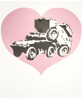
i luv me some Banksy

I wish I was in London!!
This weekend's art+culture pick comes to us from London and features UK's leading urban artist, Banksy. From April 23rd through May 16th, Andipa Gallery presents 20 original works on canvas, pallet and steel.


ps. one day I will own a huge piece of his work. I'm savin' for it. : )

Tuesday, April 21, 2009

i need some pep in my step...


Baskerville typeface coasters. I WANT 'EM!


I wish I had vaulted ceilings, you can have a lot of fun with your walls.


I couldn't wear this on a shirt. That one pillow would drive me nuts. ha-ha! I want to fix it right now! ahhhh!

Monday, April 20, 2009

On this warm Monday night....

I was looking at some old notebooks from my college days...and I ran past this quote... not sure where it came from but I dig it....
"the more things you see, the more ideas you have"

-----------
"Live Above The Influence" normally have some really good concepts but I think this is by for their best one yet...

http://www.abovetheinfluence.com/the-ads/default.aspx?path=nav

----------


Saw this on the web somewhere. Reminded me of Perspective Drawing class I took. You couldn't pick up your pencil, creating something with just one stroke.

Not sure if thats the whole reasoning behind this image, but thats what it made me think of.


"there is" by Sean Freeman;
pretty gnarly type effects.

Tuesday, April 14, 2009

Name that designer


1.
An oldie but a goodie. Who created this?


2.
He has a very distinctive style...


3.
I saw this posted a long, time ago...but I never new he created it.

Thought of the day

Tell yourself at every step in the design process that someone has undoubtedly already thought of this and what can you do to really set it apart. In design, and particularly logo design, the pessimistic axiom that “everything has already been done” is becoming more and more true, and it is only the virtuous designer who can continue to stand out in a sea of sameness.
Mike Davidson

Monday, April 13, 2009

My Daily Stalking of thedieline.com.....

When it comes to wine bottles...I love the labels that have a great color and are very clean & simple with a great typeface. (not that this one has the best type face, but I'm just saying)

I admire industrial designers. This is one bad a*s sunglass case. Order me one right now!


I really like playing off of words. That's why I really enjoy this package design. I also like the typeface used with the animal print. The designer really captures the whole "exotic" feeling/look.


I LOVE PATTERNS!! That's all.
(wise up greeting cards)


For some reason I really want to see the elephants form a cup not a square. What do you think? But its still a nice design.

Most Effective Rule of Design?

In your opinion, what rule is the most important, most critical element to good design?

A lot of things are running in my head...but I've narrowed it down to these three things:
1. Hierarchy
2. Negative space
3. Color Balance

Man oh man, I already want to add more to the list...hahaha. But I'll just stop at that. : ]

Monday, April 6, 2009

For your lunch break on this gorgeous Monday...

My brother called me up and said "Have you tried the new orbits gum, I know you will like the packaging." I'm looking all over for this new gum thinking of course if Michigan has it (where my brother lives) then Cali has to have it, right? haha. Well I couldnt find it here around Newport but this past wkend while in San Clemente I found it. The only reason why it I noticed it, was because of the package design. Anywhoo... cute package. Gum gets kinda sticky after chewing it for an hour.

Found this biz card and I was like yesssss, I love how they are looking more like the clear credit cards. How fun. I haven't seen one in person yet, so I don't know how it feels. Seems like it would be a card that would last all the wallets. :)

Saturday, April 4, 2009

i'll end the night with a good laugh....

good design/marketing team on this new skittles commercial. I think I died laughing my arsh off to it, its even more funny the 2nd view. LOL enjoy!

Friday, April 3, 2009

Ads of the World

WWF: Lungs

Before it's too late.

Advertising Agency

: TBWA\PARIS, France
Executive Creative Director / Creative Director: Erik Vervroegen
Copywriter: Nicolas Roncerel
Art Directors: Caroline Khelif, Leopold Billard, Julien Conter
Account Supervisor : Laurent Lilti
Released: April 2008

Long Pleasure Condoms

Hansaplast Long Pleasure Condoms: Blonde

Advertising Agency: TBWA\PARIS, France
Executive Creative Director: Erik Vervroegen
Creative Directors: Erik Vervroegen, Stephanie Thomasson
Copywriter / Art Director: Leopold Billard
Photographer: Cindy Gravelat
Account Supervisors: Elodie Hubsch, Pauline Laurent

Hansaplast Long Pleasure Condoms: Brunette

Advertising Agency: TBWA\PARIS, France
Executive Creative Director: Erik Vervroegen
Creative Directors: Erik Vervroegen, Stephanie Thomasson
Copywriter

/ Art Director: Leopold Billard
Photographer: Cindy Gravelat
Account Supervisors: Elodie Hubsch, Pauline Laurent

AdsoftheWorld.com


Rzeczpospolita: Woman

Rzeczpospolita: Woman

Suddenly it got scary? It's hard to tell when fun becomes disease. Don't try to check it yourself.

Advertising Agency: BBDO Warszawa, Warsaw, Poland
Creative Director: Przemek Bogdanowicz
Art Director: Maria Makowska
Copywriter: Kamil Redestowicz
Photographer: Jacek Kołodziejski
Post-production: Piotr Hołubowicz
Published: March 2009

a good horoscope to wake up to....

April 03, 2009

  1. TaurusTaurus (4/20-5/20)

    You and a new person in your life will make one heck of a good combination today -- so good, in fact, that you might see a future for the two of you. But this seamless collaboration might be a one time thing, and you need to be prepared for that. Just because things go well today does not necessarily mean that the two of you should join up and get something going. So keep your alignment loose, without a firm commitment. You will still have an amazing time together.

so tired that I can't even sleep

Its is 6:58 am and I just finished my web page, I haven't slept yet. Well I have some last minute details I need to make before I place it on the web. I wonder if I will ever learn to love web design. I find it so frustrating and exhausting. I was beginning to wonder why I ever thought about designing a new site for myself. I wanted to give up. But I have pushed myself to finish it.

Now the question that I am pondering is do I still keep www.miss-hall.net up and running with the old site for awhile (so I'd have two sites) or do I close it down and get a new url name? or do I keep miss-hall.net and change it with the new one site I created? Your thoughts?

Sorry this post is boring...this is my first blog ever...and I'm too tired to make it more interesting. Hahaha! I'll make sure and post better ones from now on.
Good night to me and...well good morning to you friends. :]